Lighthouse shows your metrics as a set of widgets on the metrics page of every team and portfolio. Each widget answers one question, and each one is documented in detail on the page for its category.
Widget Categories
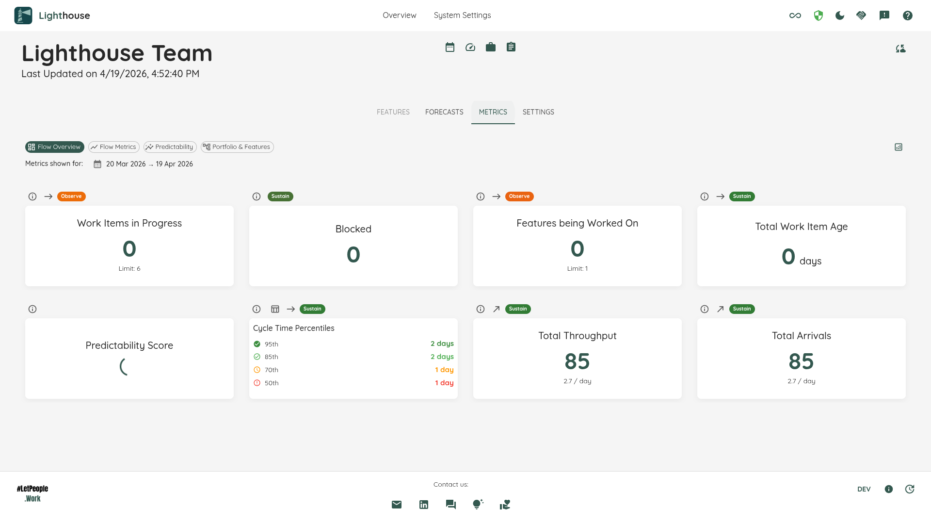
Widgets are grouped into four categories, each built around a different question. Use the category selector at the top of the metrics page to switch between them.
| Category | Question it answers | Widgets |
|---|---|---|
| Flow Overview | How is my system doing at a glance? | WIP Overview, Blocked Overview, Stale Items Overview, Features Worked On Overview (Teams only), Total Work Item Age, Flow Efficiency, Predictability Score, Cycle Time Percentiles, Work Item Age Percentiles, Total Throughput, Total Arrivals, Feature Size Percentiles (Portfolios only) |
| Flow Metrics | What do detailed flow trends look like? | Cycle Time Scatterplot, Work Item Aging Chart, Throughput Run Chart, WIP Over Time, Total Work Item Age Over Time, Arrivals Run Chart, Simplified CFD, Load Balance Matrix, Cumulative Time per State, Blocked Over Time |
| Predictability | Can we trust our forecasts? | Predictability Score Details, Percentiles Over Time, PBC Over Time, Process Behaviour Charts (Throughput, Cycle Time, WIP, Total Work Item Age, Feature Size), Arrivals Process Behaviour Chart |
| Portfolio & Features | How do features flow through the system? | Work Distribution, Feature Size (Portfolios only), Estimation vs. Cycle Time |
A few widgets are scoped to Teams only or Portfolios only, as noted above and in each widget’s own section.
Working with the Dashboard
Filtering
You can filter for a time range of your choice. By default you see the last 30 days (for teams) or the last 90 days (for portfolios). Change the start and/or end date via the date pickers and Lighthouse updates the metrics.
Not every widget reacts to this the same way: some recalculate completely, some report a snapshot as of the selected end date, and a few ignore the range entirely. Every widget section states which of the three applies under Affected by Filtering.
Expanding a Widget
Hovering over a widget reveals an Expand button in its top-right corner. Clicking it opens the widget full-screen, which helps with the denser charts.
Viewing the Data Behind a Widget
Widgets that are backed by a concrete set of work items include a View Data button (table icon) in their header. Clicking it opens a dialog showing the full set of work items that feed the widget. This gives you quick access to the underlying data without navigating away.
Total Throughput and Total Arrivals carry a View Data button too: it lists the items closed (respectively started) in the selected date range, so the rollup number can always be traced back to the items behind it. Feature Size Percentiles and Predictability Score remain rollup-only — they summarize a distribution rather than a concrete item set.
Some charts also support chart-specific drill-ins: clicking a bar, bubble, data point, or pie segment opens a dialog scoped to that particular subset (e.g. items for a single day or a specific parent feature).
Status Indicators
Most widgets display a status indicator in one of three states. The labels used in the UI are:
| Status | Colour | Meaning |
|---|---|---|
| Sustain | 🟢 Green | The metric is healthy. Keep doing what you’re doing. |
| Observe | 🟡 Amber | Something warrants attention. Monitor closely and consider action. |
| Act | 🔴 Red | Something requires immediate action or configuration is missing. |
Each widget section documents exactly how its status is calculated.
Trend Indicators
Flow Overview widgets display trend indicators comparing the current date range to a prior period of equal length. Each widget’s trend uses one of two comparison methods:
| Method | Widgets | How it works |
|---|---|---|
| Snapshot compare | WIP Overview, Features Worked On (Teams), Total Work Item Age | Compares the snapshot value at the end date against the snapshot value at the start date. |
| Previous period | Total Throughput, Total Arrivals, Predictability Score, Cycle Time Percentiles, Work Item Age Percentiles, Feature Size Percentiles, Blocked Overview | Compares the aggregate for the selected date range against the same-length window immediately preceding the start date. |
Blocked Overview compares the current blocked count against the blocked-count snapshot on the day before the selected range starts. Because blocked-count history is recorded going forward, a freshly-recording instance may have no snapshot on that boundary day yet; the trend then treats the baseline as zero, so a day-one instance reads “+N since we started recording” rather than a dash that looks like breakage. The comparison always names the boundary day it stands for, so an assumed baseline is never dressed up as a measured one. The neutral — is reserved for the one case where nothing can honestly be compared: the history holds no record at or before the selected end date at all, meaning recording began after the range you are looking at.
For percentile widgets (Cycle Time Percentiles and Feature Size Percentiles), the trend tooltip shows a per-percentile breakdown in previous → **current** format with the current-period values emphasized.
Date-Aware Snapshots
The WIP Overview, Features Worked On, and Total Work Item Age widgets use the selected date range to determine which items to include. The backend resolves the snapshot as of the end date rather than always returning the current state. This means changing the date range will change the displayed values to reflect the system state at the selected date.