The Portfolio & Features category answers how do features flow through the system. These widgets look one level above individual work items: how work is distributed across features, how big features get, and how estimates compare to what actually happened.
All widgets in this category are available for Teams and Portfolios. On a Team, a Feature’s size counts only the Team’s own Work Items: see Feature Size on a Team.
Work Distribution
| Applies to | Teams and Portfolios |
| Flow Metric | WIP, Cycle Time |
| Affected by Filtering | Yes |
The Work Distribution chart provides a visual breakdown of how work items are distributed across their parent work items (such as Features, Epics, or Initiatives). This pie chart helps you understand where your team’s effort is focused.
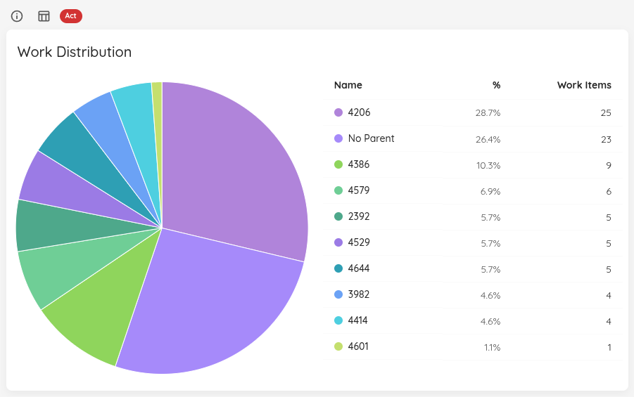
The chart displays:
- Each segment represents a parent work item and its associated child items
- The size of each segment corresponds to the number of child work items
- Hovering over a segment shows the exact count and percentage
- Items without a parent are grouped under “No Parent”
Additionally, the widget includes a table that presents the same data in tabular form, allowing for easy sorting and filtering of the work distribution information.
Viewing Details
Click on any segment of the pie chart to open a detailed dialog showing:
- The parent work item, by name, linked to it in your work tracking system
- List of all child work items in that group
- Each work item’s Work Item Age (for items in progress) and Cycle Time (for completed items), side by side, with the oldest unfinished item first
- Additional work item details (title, ID, state)
This visualization helps you:
- Identify which features are consuming the most team capacity
- Spot imbalances in work distribution across different initiatives
- Understand the relationship between parent initiatives and actual work being done
- Find work items that may not be properly linked to parent items
The chart combines both completed work items (from the selected date range) and items currently in progress to give you a complete picture of work distribution. This means you can see not just what was done, but also what’s currently being worked on under each parent item.
Status Indicator
| Status | Condition |
|---|---|
| 🔴 Act | 20% or more of work items are not linked to a feature, or no Feature WIP is configured, or work is spread across more than 120% of the Feature WIP limit. |
| 🟡 Observe | Work is spread across slightly more features than the Feature WIP limit (up to 120% of it), or unlinked items are below 20%. |
| 🟢 Sustain | Work is spread across a number of features within the Feature WIP limit, and fewer than 20% of items are unlinked. |
Feature Size
| Applies to | Teams and Portfolios |
| Flow Metric | Cycle Time, Work Item Age, Throughput |
| Affected by Filtering | Yes |
This chart shows the size of your Features on a scatter plot, with the ability to filter by state category.
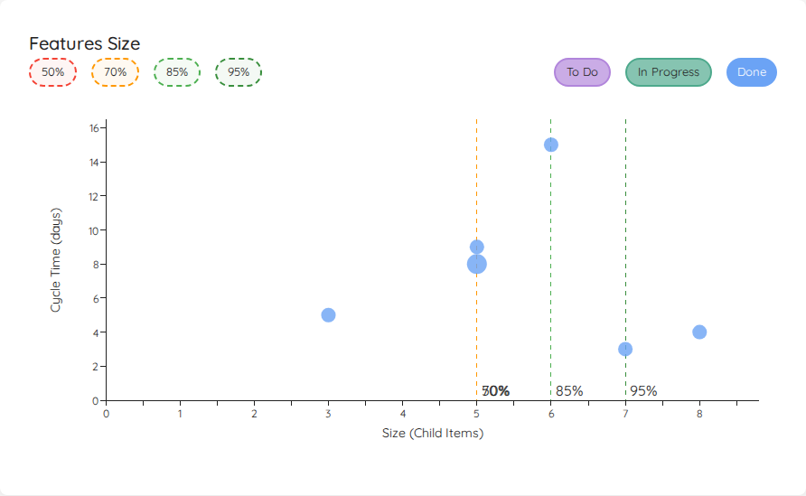
The chart displays features from your selected time range. A toggle above the chart lets you choose what gets plotted on which axis:
| Mode | X-axis | Y-axis | Available when |
|---|---|---|---|
| Cycle Time (default when no estimation field) | Feature size (child items) | Cycle time / Work item age (see below) | Always |
| <Estimation Unit> (default when an estimation field is configured) | Feature size (child items) | Estimation value | Estimation field configured (Portfolios only) |
| Closed Date | Closed date | Feature size (child items) | Always |
The toggle is shown whenever there is data to plot — you don’t need an estimation field to switch into Closed Date mode. The previously-shipped behaviour of hiding the toggle when no estimation field is configured has been replaced by a permanent two-option toggle (Cycle Time / Closed Date) in that case.
Closed Date Mode
In Closed Date mode the axes swap: feature size moves to the Y axis and the X axis becomes a timeline of close dates. This view is useful for spotting when oversized features are landing and how that distribution shifts over time.
- Closed features are plotted at their
closedDateon the X axis. - In Progress and To Do features have no closed date — they are pinned to today on the X axis so they remain visible alongside the closed work. They keep their state-category colour and chip-toggle behaviour.
- The right edge of the X axis is always today, regardless of which state-category chips are active. Toggling To Do or In Progress off won’t make today disappear off-screen.
- The size percentile reference lines are drawn horizontally in this mode (they cut across the chart at the percentile size value), so a feature plotted above the 85% line is in the upper 15% by size.
State Filtering
The chart includes three filter chips on the right side to show or hide features by state:
- Done (enabled by default): Shows completed features using their cycle time
- To Do (disabled by default): Shows unstarted features positioned at the y=0 baseline
- In Progress (disabled by default): Shows features currently being worked on using their work item age
Features in the To Do category with a size of 0 (no child work items) are automatically filtered out, as they represent features that haven’t been broken down yet.
Time Metrics by State (Cycle Time mode)
In Cycle Time mode the y-axis value differs based on the feature’s state:
- Done features: Display their cycle time (how long they took from start to completion)
- In Progress features: Display their work item age (how long they’ve been in progress)
- To Do features: Appear at y=0 (no time elapsed yet)
This allows you to see:
- How feature size correlates with cycle time for completed features
- How long current features have been in progress relative to their size
- The size distribution of features in your backlog
In Closed Date mode the y-axis is feature size and the state-by-state rules above no longer apply — see Closed Date Mode above.
Percentile Lines
Similar to the Cycle Time Scatterplot, you can show percentile lines to understand your feature delivery patterns. Multiple features with the same size and time value are grouped in a bubble - the larger the bubble, the more features it represents.
Click on any bubble to see detailed information about the feature(s) it represents.
Status Indicator
The Feature Size chart evaluates every active (To Do and In Progress) feature against the 85th and 70th percentile sizes derived from historically completed features in the selected date range.
| Status | Condition |
|---|---|
| 🔴 Act | At least one active (To Do or In Progress) feature has more child items than the 85th percentile size of completed features. |
| 🟡 Observe | No feature exceeds the 85th percentile, but at least one active feature has more child items than the 70th percentile size — it may grow further. |
| 🟢 Sustain | All active features are at or below the 70th percentile size, or no historical size data is available yet. |
If no active features exist, the status defaults to Sustain.
Feature Size on a Team
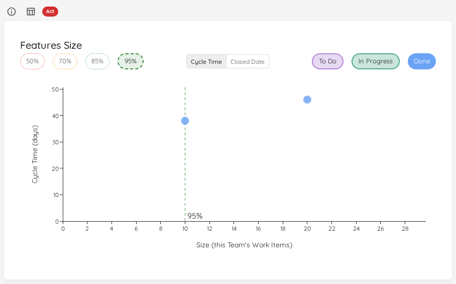
On a Team, a Feature’s size is this Team’s share of it: the number of the Team’s own Work Items under that Feature, in any state. Other Teams’ Work Items under the same Feature are not counted. This answers how much of a Feature do we usually take on, and pairs with the Team’s own Cycle Time.
- Which Features are shown: every Feature that a Portfolio in Lighthouse loads and that has at least one of the Team’s Work Items under it. The Team does not need to be part of that Portfolio. Features using the Default Feature Size are left out, as they are not broken down yet.
- What the chart says: the size axis reads Size (this Team’s Work Items), and a bubble’s tooltip names its size as this Team’s share.
- Modes: Cycle Time and Closed Date. The estimate of a Feature is configured on its Portfolio, so there is no estimation mode on a Team.
- Dates: a Feature’s closed date and Cycle Time are the Feature’s own, not the day the Team finished its share.
- Access: reading the Team is enough to see all of these Features. Portfolios you may not read are not named to you.
- Everywhere on the Team’s page: wherever the Team’s page lists a Feature’s size, such as the Features in the Features Worked On Overview, the Size is the Team’s share too.
The Status Indicator applies the same rules as on a Portfolio, comparing each open Feature’s share with the shares of the Features the Team finished.
When there are no Features to show, the chart says No Features to show.
Estimation vs. Cycle Time
| Applies to | Teams and Portfolios |
| Flow Metric | Cycle Time |
| Affected by Filtering | Yes |
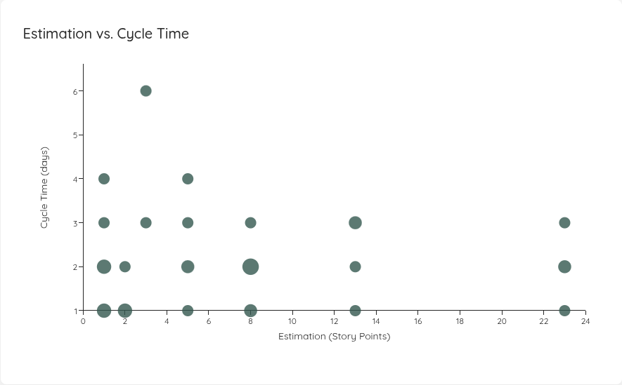
This scatter plot helps you understand how work item estimates correlate with actual cycle time. By visualizing this relationship, you can spot whether your estimations are in any way trustworthy compared with actual time it took to deliver.
Configuration
To use this chart, you first need to configure an estimation field in your Team or Portfolio settings. You can configure:
- Numeric estimates: Story points, t-shirt sizes with numeric values, or any custom numeric field
- Categorical estimates: T-shirt sizes (XS/S/M/L/XL) or other categorical fields with explicit ordering
Chart Layout
The scatter plot displays:
- X-axis: Estimation values (story points, t-shirt sizes, or custom estimates)
- Y-axis: Cycle time (how long items took to complete)
- Each dot or bubble represents one or more completed work items from the selected time range
- Larger bubbles indicate multiple items with the same estimation and cycle time
Similar to the Cycle Time Scatterplot, you can click on any data point to drill into the underlying work items and see their details. The list shows each item’s Estimate next to its Cycle Time and the day it closed, sorted by Cycle Time, so the items that took far longer than their Estimate suggested stand out at the top. View Data in the widget header lists every plotted item the same way.
This chart only appears after you’ve configured an estimation field. If no estimation field is configured, the chart will not be visible.
Status Indicator
The status is based on the Spearman rank correlation between estimates and actual cycle times — a measure of whether higher estimates consistently lead to longer cycle times.
| Status | Condition |
|---|---|
| 🔴 Act | Estimation is not configured, or the Spearman correlation is below 0.3 — no meaningful relationship between estimates and cycle time. |
| 🟡 Observe | Correlation is between 0.3 and 0.6 — a weak relationship exists; review your estimation approach. |
| 🟢 Sustain | Correlation is 0.6 or above — estimates correlate well with actual cycle time. |
A minimum of 2 data points is required to calculate correlation. With fewer items, the status defaults to Sustain until enough data is available.